How to Create a Luxurious Interior Using Neutral Colors

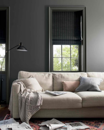
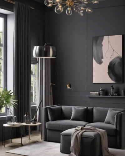
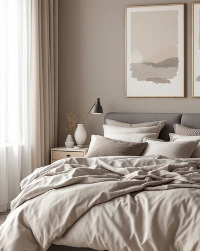
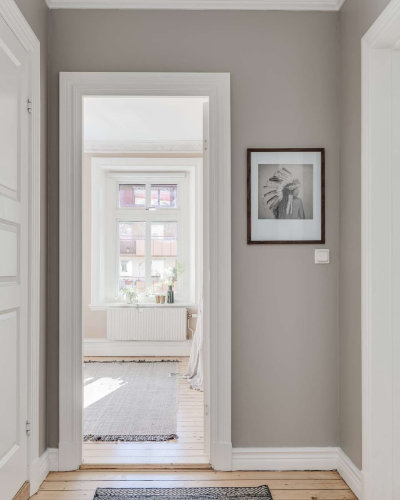
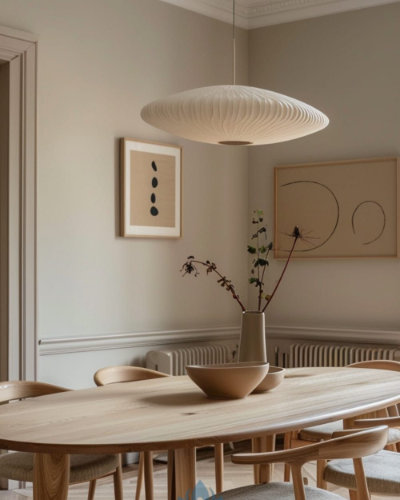
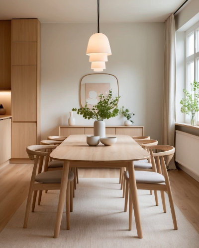
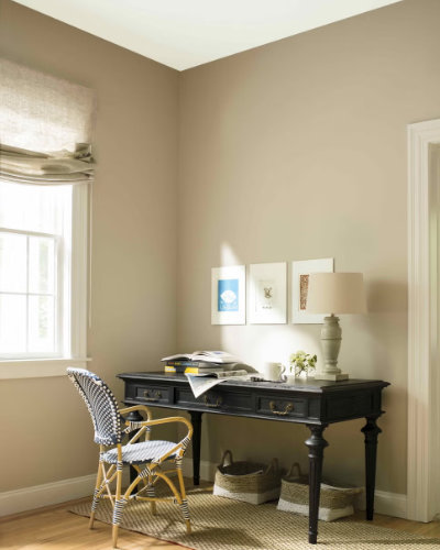
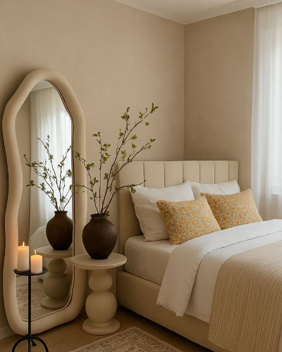
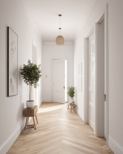
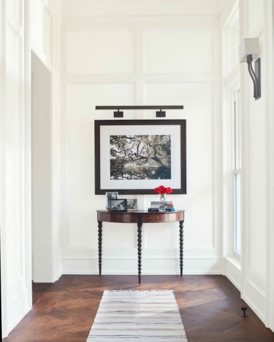
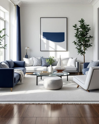
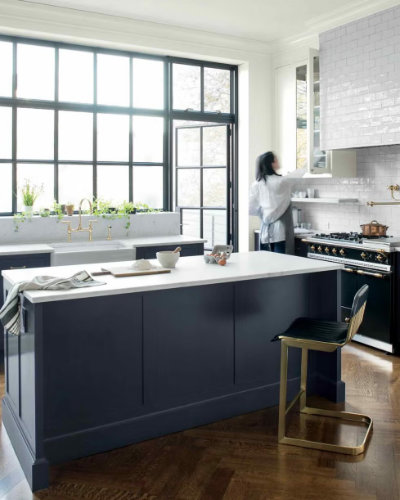
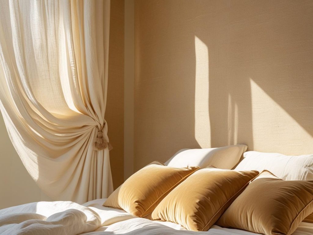
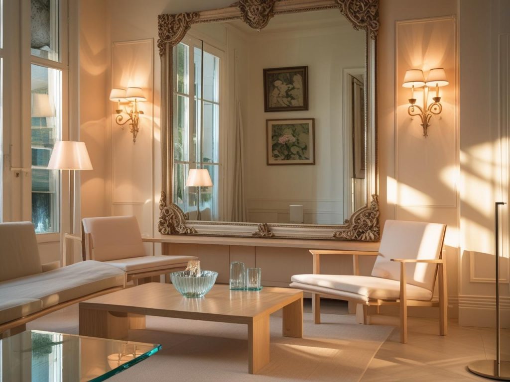
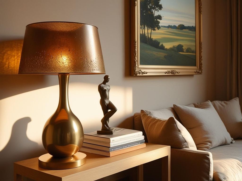
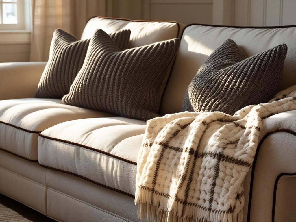
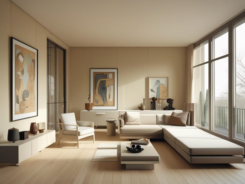
Neutral doesn’t mean boring. When thoughtfully applied, neutral tones can serve as the foundation for a refined, elegant, and timeless interior. Beige, gray,
cream, and warm whites can easily adapt to any style and help you create a space that feels both harmonious and high-end. The key lies in the details — choosing the right shade, combining textures, using light wisely, and investing in quality finishes.
Here’s how you can use neutral colors to make your interior look more luxurious— without going over budget.

Would you like to become an Interior Designer?
This week start to study in Italy online
Teachers are Italian stylists and designers. Personal tutor. Certificate from an Italian school.
Since August, 1 we will have an annual price increase

 Learn more

1. Choose complex and layered shades

The more nuanced the shade, the more sophisticated it looks.
Avoid flat, basic colors like plain gray or beige. Instead, look for tones with subtle undertones — think greige (gray-beige), dusty olive, or smoky navy. These hues add depth and richness, especially when paired with natural light.
Examples of sophisticated neutral tones:

  • Deep charcoal gray – creates a cocoon-like, intimate atmosphere. Perfect for bedrooms and home offices.
  • Greige (gray-beige) – a versatile choice that works with both classic and modern interiors.
  • Warm light gray – brightens a space while keeping it soft and welcoming.
  • Soft beige – a timeless option that pairs beautifully with wood, brass, and black accents.
  • Warm white – cozy and clean, especially in rooms with natural textures.
  • Slate blue with a gray tint – adds depth and character, great for hallways and dining areas.

2. Invest in high-quality paint

Even the most beautiful color will look cheap if the paint quality is low. Premium paints offer better coverage, deeper pigmentation, and a more refined finish. They’re also more durable and easier to clean — making them a smart long-term choice.
Tip: Look for paints with a matte or eggshell finish — they absorb light softly and give walls a rich, velvety look that feels expensive.

3. Mix textures for depth

The same color can look completely different depending on the texture of the surface. To avoid a flat or bland look, layer various textures:

  • matte and glossy surfaces;
  • natural wood and stone;
  • textiles like linen, velvet, wool, and cotton.
  • Example: beige walls + cream linen curtains + sand-colored velvet cushions = depth and harmony in a tone-on-tone design.

4. Use lighting to enhance the palette

Lighting is a crucial tool in a neutral interior. Warm lighting enhances depth and softness, while cool lighting can flatten even the most elegant shade.
Recommendations:

  • Choose bulbs with a temperature of 2700–3000K.
  • Combine general lighting (ceiling) with accent lighting (floor lamps, sconces).
  • Use reflective surfaces: mirrors, glass, light-colored furniture.

5. Add minimalist, high-impact accents

Neutral tones create the perfect backdrop for carefully selected statement pieces.
To keep the interior from feeling empty, incorporate a few eye-catching accents:

  • brass, bronze, or gold in fixtures and hardware;
  • framed artwork or black-and-white photography;
  • sculptural objects, books, or vases with texture.
  • Pro tip: Keep accents minimal but intentional — this conveys a sense of curation and luxury.

6. Choose furniture and textiles with presence

To elevate the space:

  • opt for furniture with soft, curved silhouettes;
  • hang curtains made of dense, textured fabrics like velvet or wool;
  • use solid-colored textiles with a tactile finish.
  • Example: a beige sofa with contrasting piping + warm gray cushions + a chunky knit throw = refined yet cozy.