7. Choosing Curtains That Look Too Short or Too Thin
Curtains can completely transform a room, but poorly chosen window treatments often have the opposite effect.
Curtains that stop awkwardly above the floor, hang from a rod positioned too low, or use fabric that doesn't suit the room can make the windows look smaller.
Very thin, unlined curtains may also lack the fullness needed for a more elegant appearance.
However, sheer curtains can be an excellent choice when a light, airy effect is intentional.
How to fix it
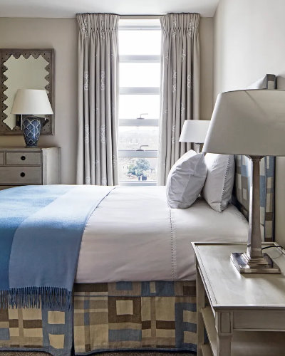
For a classic, elegant look, position the curtain rod above the window frame and, where possible, extend it beyond the sides of the window.
This can make the window appear taller and wider.
Full-length curtains that just touch the floor usually create a more polished effect than curtains ending several centimeters above it.
For bedrooms and formal living rooms, consider lined curtains that provide better structure, privacy, and light control.
You don't necessarily need expensive fabric. Correct measurements and good proportions can make affordable curtains look much more sophisticated.
8. Ignoring Small Details Such as Handles and Hardware
Sometimes the smallest details have the greatest impact on the overall appearance of a room.
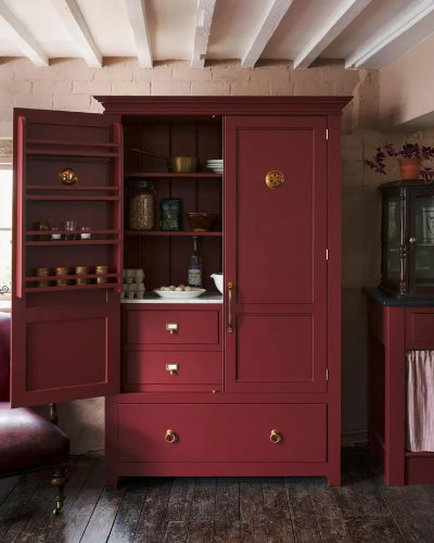
Basic plastic cabinet handles, poorly matched metal finishes, or inexpensive-looking door hardware can undermine an otherwise attractive interior.
This is especially noticeable in kitchens and bathrooms, where handles, taps, and fittings are highly visible.
How to fix it
Consider replacing standard cabinet handles with more distinctive designs.
Brushed brass, satin nickel, antique bronze, or simple black metal can work beautifully, depending on the interior style.
The key is consistency.
For example, if your kitchen has warm wood cabinets and beige stone countertops, brushed brass handles may create a more harmonious combination than bright chrome.
You don't need to replace every fitting in the house. Updating the most visible details can make a noticeable difference.
9. Using a Flat, Lifeless Color Scheme
Neutral colors are popular because they are versatile and easy to combine.
However, an interior decorated entirely in the same shade of beige, gray, or white can sometimes feel flat and unfinished.
The problem isn't the color itself. It's the absence of contrast, texture, and depth.
A beautiful neutral interior usually contains several related shades and a variety of materials.
How to fix it
Instead of using just one beige tone, combine cream, sand, caramel, and warm brown.
Introduce different textures through linen curtains, wool rugs, wooden furniture, ceramics, and upholstered pieces.
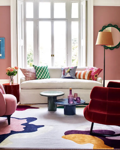
You can also add a deeper accent color.
For example, a beige living room might benefit from olive-green cushions, a dark wooden coffee table, or a burgundy armchair.
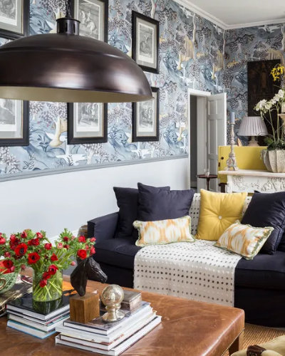
Another option is to create a more dramatic interior using a rich color on the walls, doors, and architectural details.
Color is one of the most powerful tools in interior design, and learning to use it correctly can transform a room without expensive renovations.