Top interior design mistakes which people make

When purchasing a home, many people have a desire to do redecoration and repairs on their own. However, often they do not pay attention to details that can spoil all the work done.
Today, our teachers, Italian interior designers, will share examples of common mistakes that should be avoided when creating an interior.

Do you like decorating your home?
Make it your profession. Become an interior designer!

Wrong furniture size

Both a lot of small objects and a few large objects can overwhelm your room.
It is important to choose the right proportions. Objects of different heights, shapes and types will make the room more interesting.
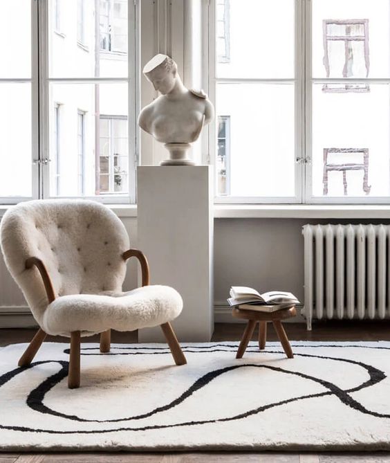
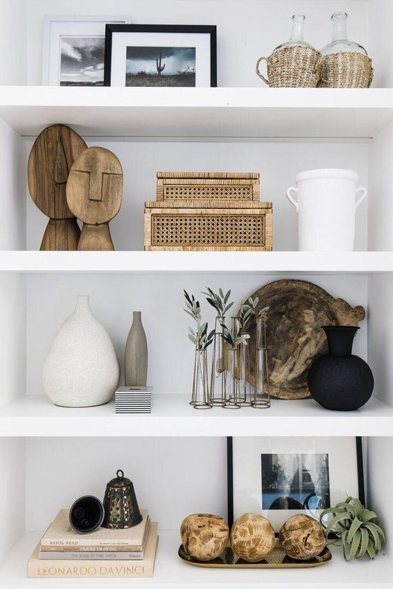
Photo source: https://www.pinterest.ru/pin/286893438754030939/
Photo source: https://www.pinterest.ru/pin/268879040245682354/

Overabundance of decor

Too many decorative elements will make your interior look dated.
Leave only the most interesting accessories. Combine different textures and shapes, it will add appeal.
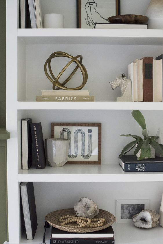
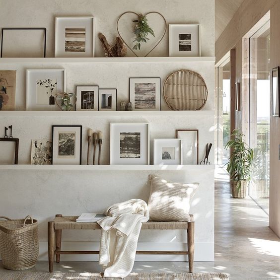
Photo source: https://www.pinterest.ru/pin/482025966365631920/
Photo source: https://www.pinterest.ru/pin/562809284692873590/
Photo source: https://www.pinterest.ru/pin/341429215511900203/

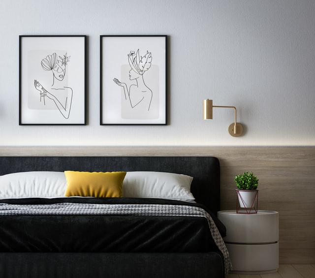
Wrong picture size

Small pictures on the wall can look silly, but a large picture can become the focal point of the room.
The main rule: the location at eye level is the most optimal.
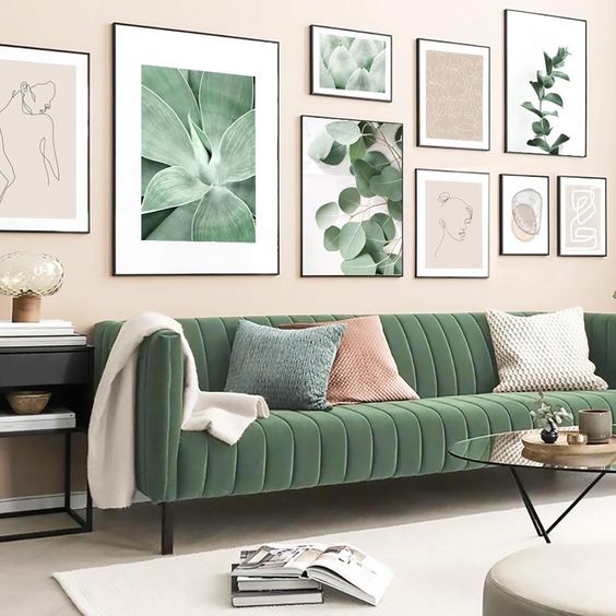
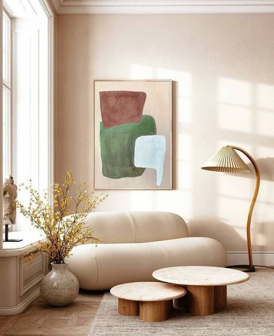
Photo source: https://www.pinterest.ru/pin/AfkJsW4s9Ni66Mp0yO9nLWQQ8f63CJmfjzEt9VF2Gva6NBWa6X5O_tKmxuzJ4UM0sTls-14Agm79iQC7lXxYrrQ/
Photo source: https://www.pinterest.ru/pin/7177680647486461/

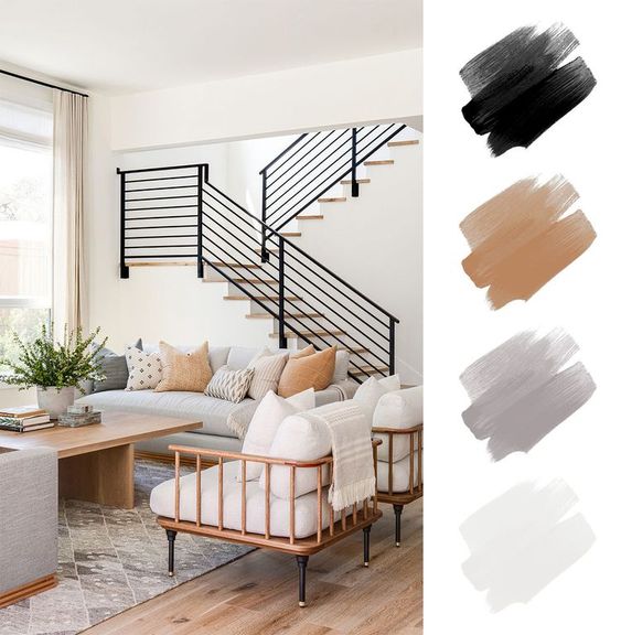
Wrong color scheme

Neutral colors look chic, but only if they are chosen correctly. Otherwise, the interior becomes cold and harsh.
When choosing neutral tones for a room, don’t forget to add coziness with warm textures and colors.
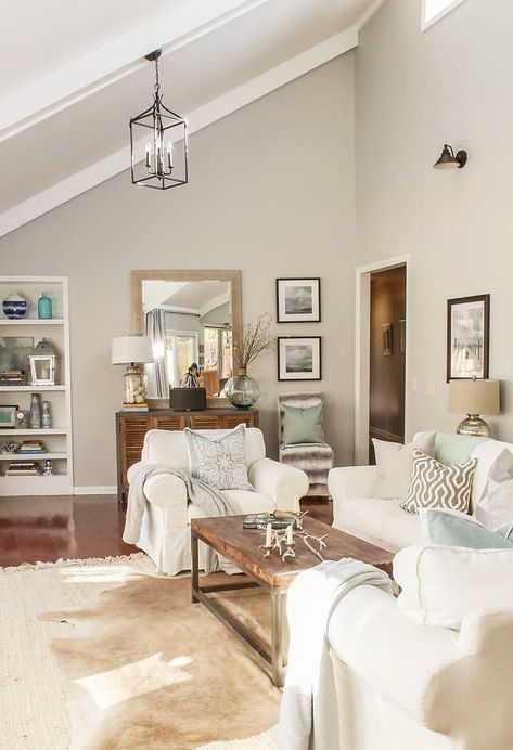
Photo source: https://www.pinterest.ru/pin/14566398783654376/
Photo source: https://www.pinterest.ru/pin/181621797462763778/

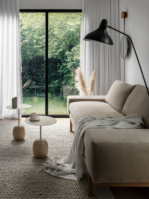
Sofa pushed close to the wall

The space between the wall and furniture will make the room airy and bright. If you have a small living room, try separating the sofa from the wall with a floating shelf or console table.
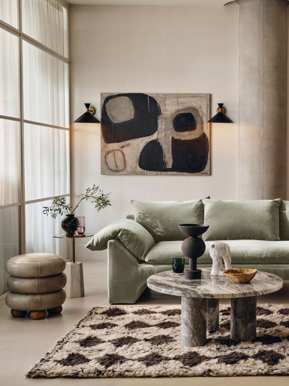
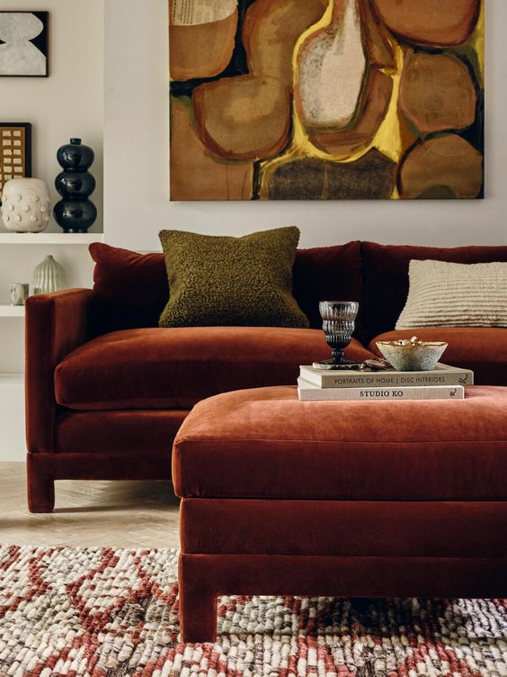
Photo source: https://www.pinterest.ru/pin/295408056817045015/
Photo source: https://www.pinterest.ru/pin/370772981834629199/

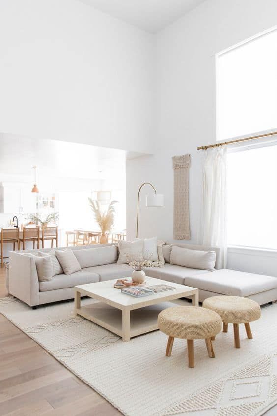
Disproportionate carpet

Make sure the rug is the correct size. To do this, the carpet should be located under the front half of each piece of furniture that is in the room.
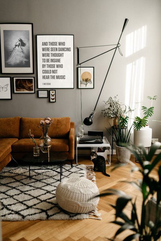
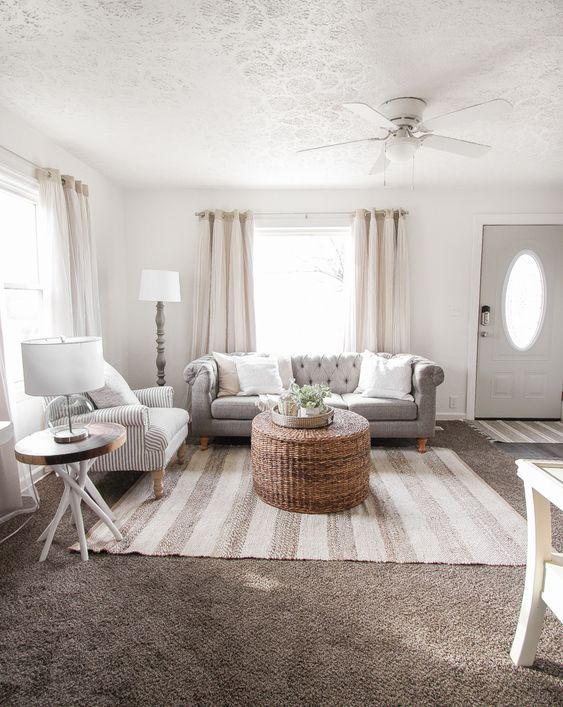
Photo source: https://www.pinterest.ru/pin/137711701094431156/
Photo source: https://www.pinterest.ru/pin/317503842487614310/
Photo source: https://www.pinterest.ru/pin/580542208226041182/

Overabundance of metallic accents

While a chrome floor lamp can look classy, ​​pairing a few metal pieces together looks gaudy.
An excess of metal can deprive a room of warmth and comfort.
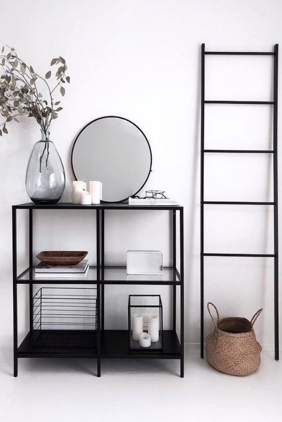
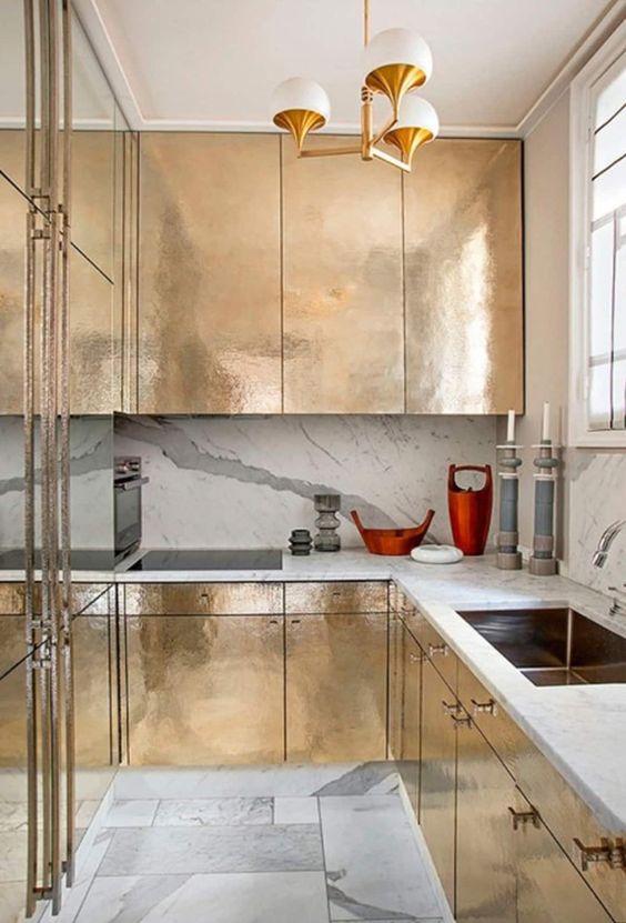
Photo source: https://www.pinterest.ru/pin/788552216015999433/
Photo source: https://www.pinterest.ru/pin/485544403584358314/

House in one color

One color for everything is an outdated trend. Mixing styles and tones will add depth and interest to your interior.
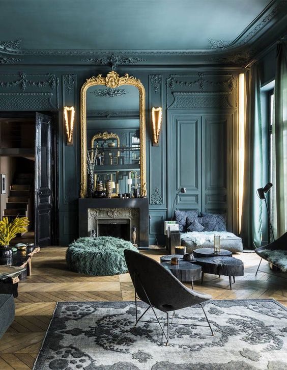
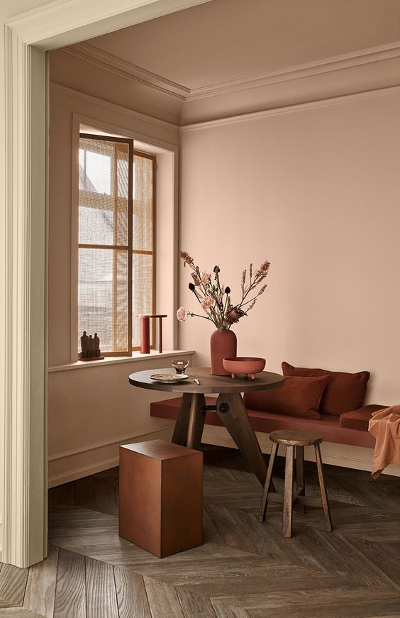
Photo source: https://www.pinterest.ru/pin/749567931709581896/
Photo source: https://www.pinterest.ru/pin/291115563423378961/