Choosing a color palette for the interior of a room is always a difficult process.
Today our teachers, interior designers, offer you 4 important rules that you can follow when choosing a color scheme for your home.
Choosing a color palette for the interior of a room is always a difficult process.
Today our teachers, interior designers, offer you 4 important rules that you can follow when choosing a color scheme for your home.
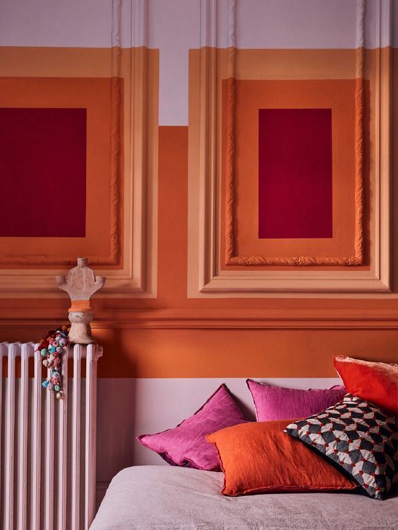
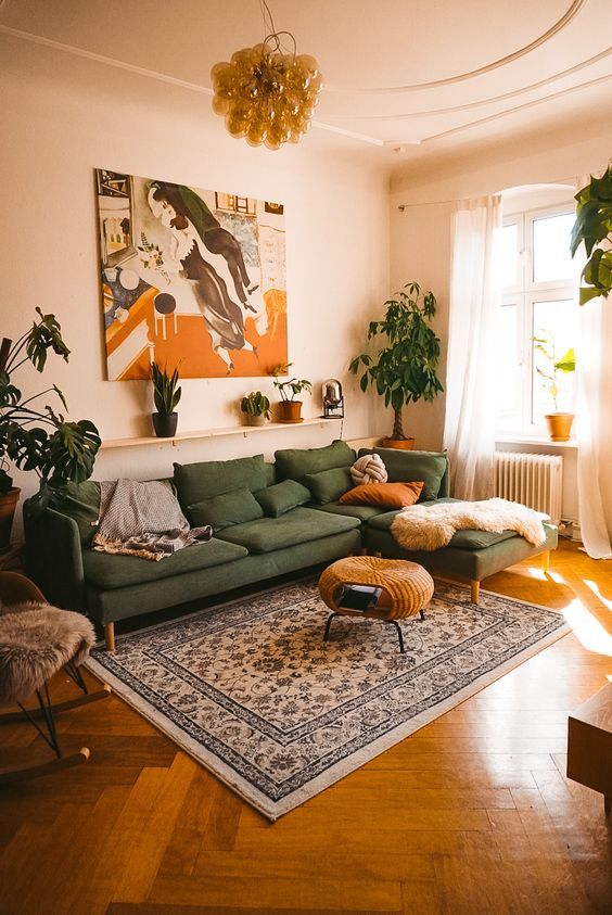
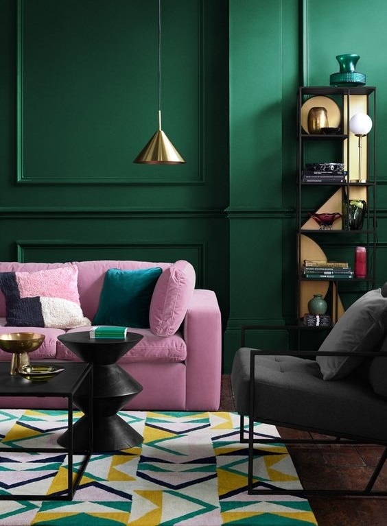
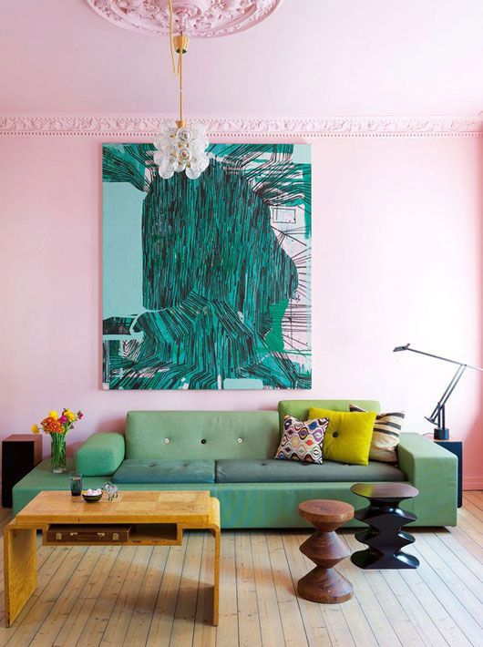
This rule must be taken into account in order to make the color palette balanced. This rule implies the use of 3 colors in the interior of the room.
First you need to choose the dominant color, which will take up most of the room (about 60%). This is usually a neutral or muted shade that won't overload the room.
Next, you need to choose the second shade. It is a bit bolder and will take up about 30% of the space.
And finally, the accent color is the boldest shade that will cover the remaining 10% of the room.
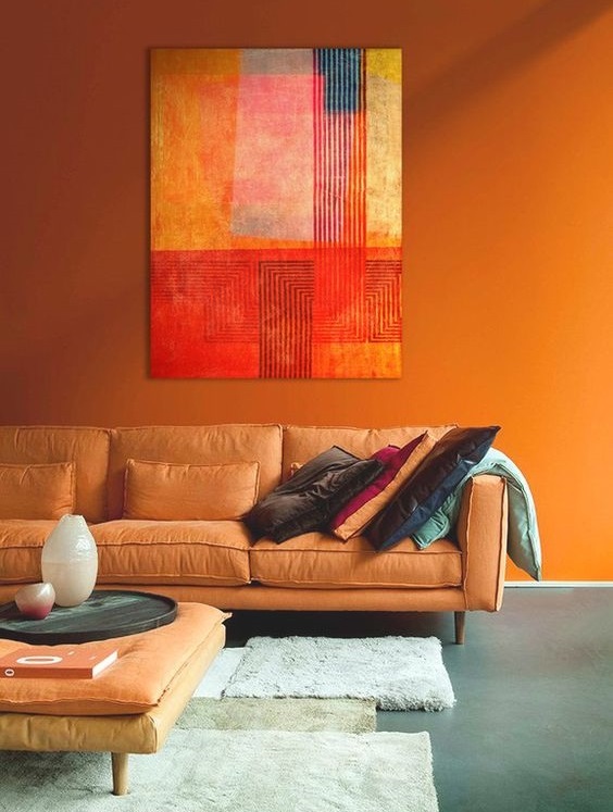
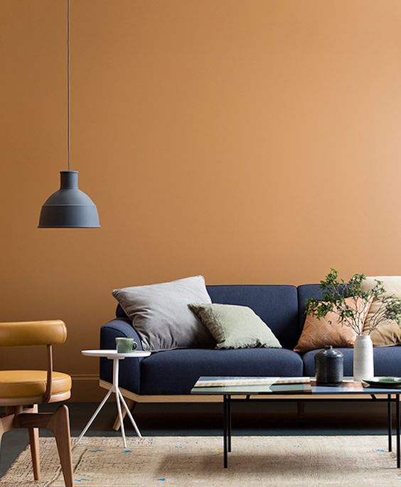
Warm colors tend to create an upbeat and welcoming atmosphere in a room, and are best suited for decorating a dining room or kitchen.
Cool colors are more muted. They work best in bedrooms and office spaces where calming energy is appreciated.

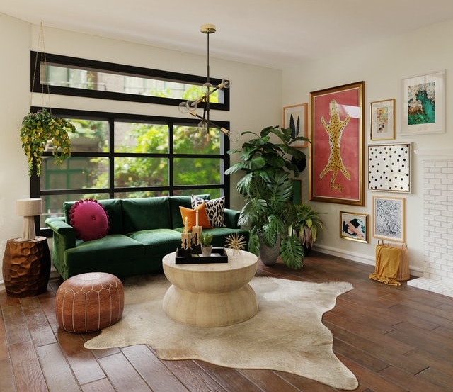
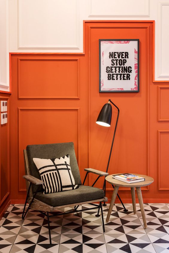
This color scheme includes only two shades. As a rule, these shades are located opposite each other on the color wheel, which means that you get such contrasting combinations as blue and orange or yellow and purple.
Such combinations certainly bring a lot of energy to the space, but they are best used in small doses.
Balance this contrast with an abundance of neutral colors to provide some rest for the eyes.
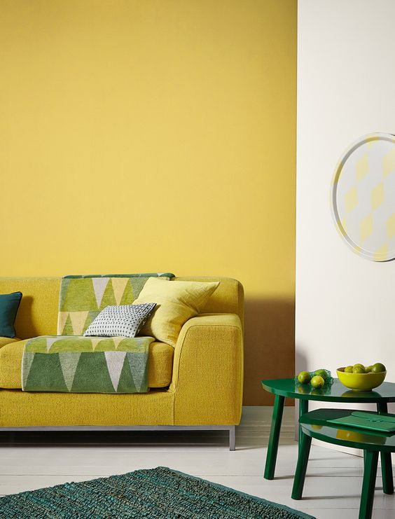
Matching analog colors is very easy. To do this, you need to select a center color and then use the colors on either side of it.
Here, two colors will be primary, and the third will be their mixture. For example, red, purple and blue.
If you're not a big fan of bright hues, you can also create an analogous color scheme using neutral shades.