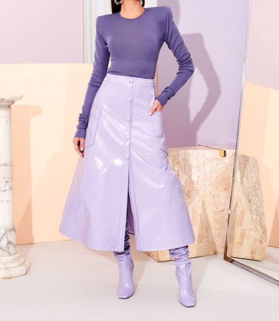
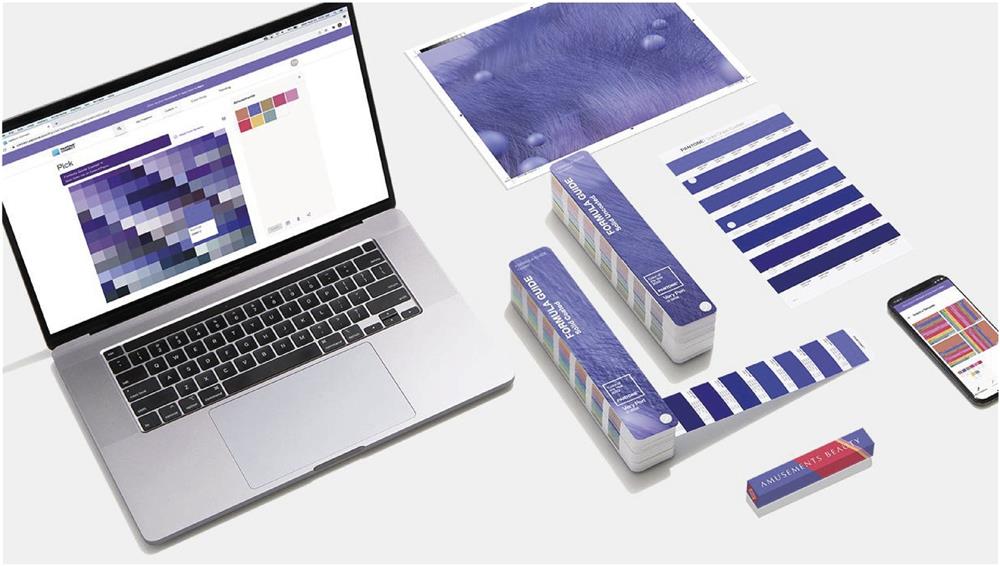
The Pantone Color Institute has named the main color of 2022. It is a lilac shade under the number 17-3938 and the name Very Peri (we may interpret it as "Very beautiful").
Let's take a look at how Pantone's decision affects our lives (if at all).
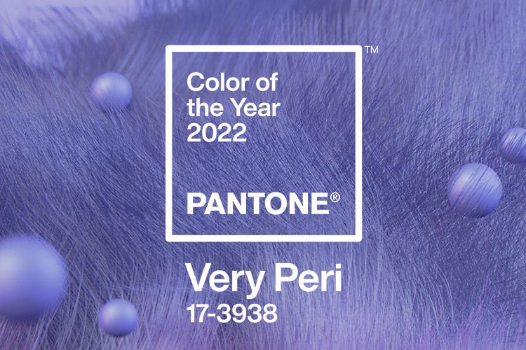
The Pantone Color Institute has named the main color of 2022. It is a lilac shade under the number 17-3938 and the name Very Peri (we may interpret it as "Very beautiful").
Let's take a look at how Pantone's decision affects our lives (if at all).
It is a large American company that develops color palettes and standards, consults brands, analyzes (and predicts) market trends.
In the early 60s, its employees developed a universal standardization system for all colors existing in the world - the Pantone Matching System, or PMS for short. All colors and shades in it were given names and numbers, and the catalog was a large multi-colored fan-layout: it was very convenient to use. The system quickly became popular, as it made it possible to significantly simplify the work of everyone involved in design.
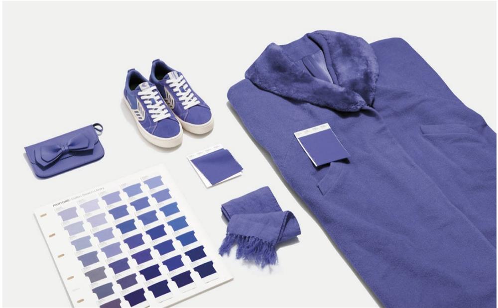
The institute's employees study how color affects all areas of our lives: from emotions to consumer demand, and also predict color trends.
Since 2000, this organization annually names the color, which is gradually beginning to prevail in all areas - from cinema to industrial design, which means that in the next 365 days it will be the most relevant and trendy.
Throughout the year, the staff of the Pantone Color Institute closely monitor which shades are used most often in the world. They follow fashion collections, exhibitions and art projects.
Pantone watches new films from influential directors to understand what shades prevail on the screen, and keeps track of car innovations. Looking at a new car, many people start to want lipstick or a pair of shoes in the same shade, or even dye their living room in that color.
Twice a year, representatives of the institute hold a meeting in a classified location, and in December Pantone announces the main color of the next year.
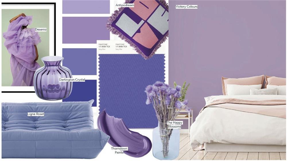
It should be understood that Pantone assigns a shade that has already become popular as the color of the year. That means, it is not color that comes into fashion thanks to Pantone, but exactly the opposite.
On the other hand, the official recognition of Pantone makes the shade even more trendy.
Are brands doing their own thing - without Pantone's involvement - to make more products in the color of the year? Some, yes, but as a rule, we are not talking about big fashion houses.
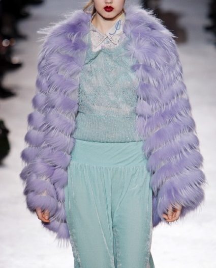
Pantone believes that the Very Peri color combines the "persistence" of blue with the "energy and excitement" of red and symbolizes dynamism, creativity, imagination and forward movement.
The Institute of Colors explained their choice by the fact that Very Peri is a symbol of the global spirit of the times and the transition period that society is going through.
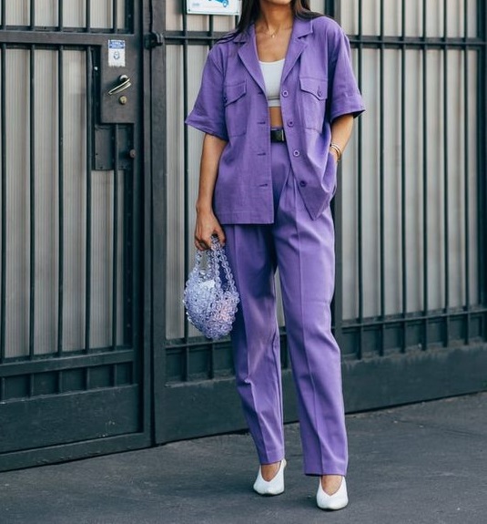
For many girls, such a pale shade of blue seems very dangerous, and they hardly dare to wear a total look in such tones. And how, then, to support the key trend of the next year?
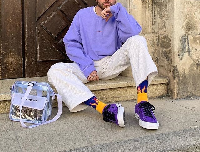
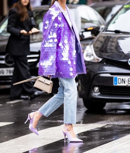
The safest option is to choose shoes or accessories in this color. For example, it can be a bag.
You can also choose one piece of clothing, but it should be removed from the face, for example, a skirt.
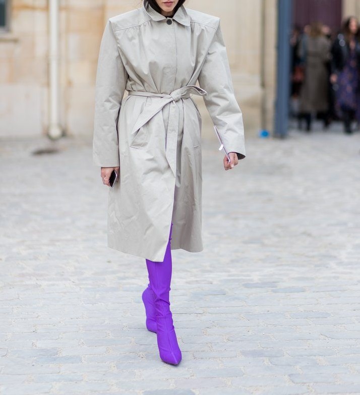
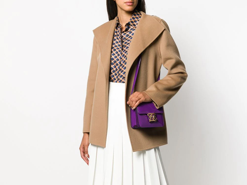
The universal black, white, gray and beige, of course, has not been canceled - but the most spectacular will be a combo of lavender and green.
True, it is worth focusing not on saturated herbal shades, but on delicate and pastel ones, for example, mint. It will look great in combination with Very Peri and yellow, especially its muted tones.
