How to properly arrange store windows during a sale: attracting, not scaring customers away.

sale_1

The sale period is a golden time for stores. But in order to attract buyers to your store specifically, the display window should be attractive, not shouting. Successful design is a balance between information about discounts and maintaining the brand image. Here’s what you should consider.

Secret Sale
Study as “Visual Merchandiser”
You can start to study as a Visual Merchandiser in Italy online with 50% discount
+ online marathon “30 Days Fashion challenge” as a gift

Learn details

What to Do: Rules for an Effective Showcase

  1. One Clear Message
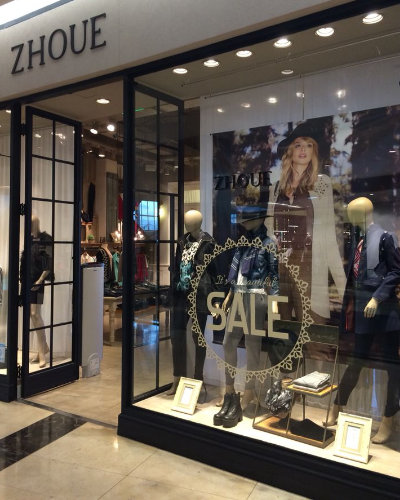
    The main message should be the discount, promotion, or seasonal sale. Highlight it clearly, prominently, and without unnecessary words.
    Examples: Sale up to -50%, Final Discounts, Summer Collection Sale.
  2. Use Your Brand Style
    Fonts, colors, and logos — everything should stay within the brand’s visual identity. Even during sales, it’s important to maintain brand recognition and audience loyalty.
  3. Sell Style, Not Just a Discount
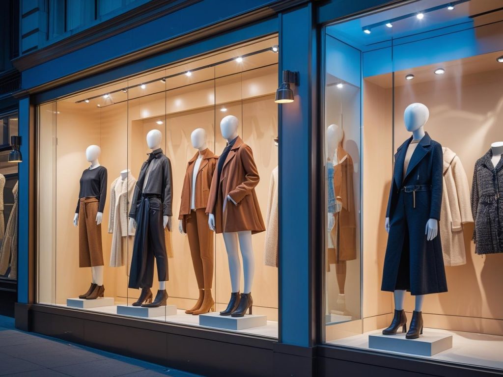
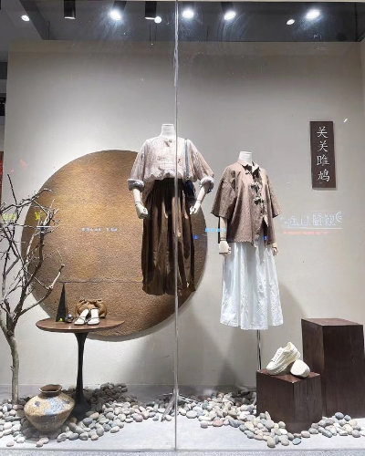
    Display an eye-catching look or 2–3 well-styled outfits in the window — this shows that the items are still stylish and desirable, even at a reduced price.
  4. Limited Color Palette
    It’s best to use no more than 2–3 main colors: one accent color (e.g., red or yellow for “SALE”), and the rest neutral (white, gray, black).
  5. Create a Sense of Urgency
    Add a visual element that signals: “Hurry, limited stock,” “Only Until the End of the Week,” “Final Sale.” But don’t overdo it.
sale_2
sale_4

Main mistakes in window display design during sales

  1. Overloading with text and visuals
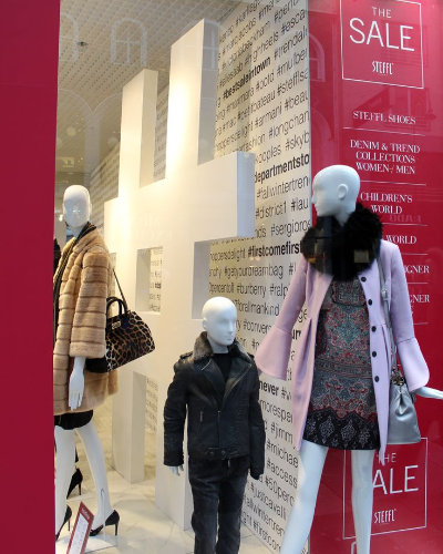
    Tiny text, too many signs (“70% here”, “Sale”, “Discount on discount”) — to a customer, this looks like chaos, not an attractive offer.
  2. Dirty, worn-out, or outdated elements
    Signs with crumpled corners, faded posters, peeling stickers on glass create the impression of a cheap second-hand shop, not a well-known brand offering discounts.
  3. Meaningless product clutter
    A display window packed with random items (especially those of different types) doesn’t make people want to come in — it lacks focus. It’s better to showcase 1–2 perfect looks.
  4. Shouty, tacky design
    Too much red, neon lights, arrows, 10 different signs with the word SALE — all this tends to irritate rather than attract.
  5. Missing prices or unclear promotion terms
    If a discount is indicated but it’s unclear what exactly it applies to or how it works, it confuses customers. It’s better to clearly state: “30% off everything all summer” or “50% off the second item.”
sale_3
sale_5

It’s important to remember:
Your storefront is the face of the brand. Even during a sale season, it should convey style, taste, and value — not just low prices.